Clarifying software architectural diagrams
At the beginning of my career, hardware and software architectural diagrams intimidated me a bit. But I’ve come a long way since then; thought I won’t claim to understand all the conventions of UML diagrams, I can come up with my own diagrams and get conversations started. Also, I’ve gotten fed up enough with “chart junk” over the years that I’ve read and re-read Edward Tufte’s The Visual Display of Quantitative Information, and I make it a point to eliminate extraneous visual information, just as a I eliminate extraneous text.
Goals and results
I wanted to revise a high-level software rearchitecture diagram in order to clarify the formal software design specifications I was writing as a release manager. I would never claim that my color choices were great from an accessibility or design perspective, but my goal of sparking discussion was met, and from those discussions I was able to write new software design specifications.
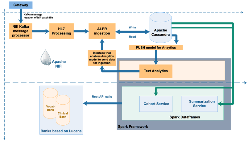
Before
The lead software developer created the following diagram to capture software design discussions. There was ‘chart junk’ in the form of solid boxes, dotted lines, and split arrows, while information on the underlying implementation was lacking.
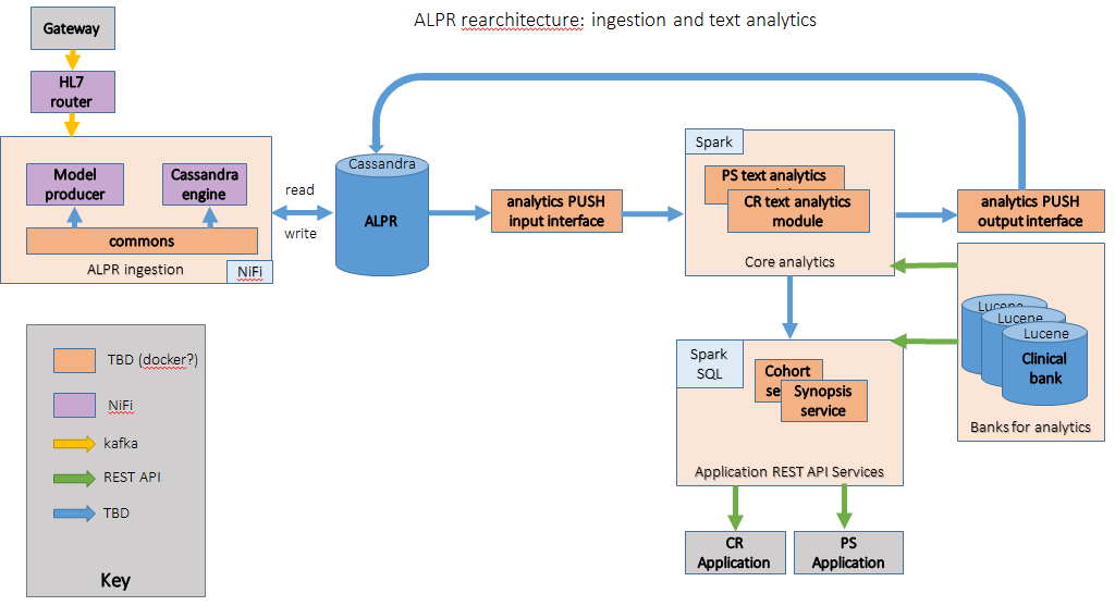
After
I used a visual key to cram more implementation information into the diagram (and point out “TBD” areas), simplified arrow direction to flow from left to right and top to bottom, and added clarifying details.