Cutting down on documentation by contributing to UX
TLDR
To skip straight to my writing sample, see Debugging a Device in the SFP While in Use by Another Application
Goals and results
My assignment was to document a feature that allowed two different programs to hand off read/write access to a device. (An analogy in the consumer electronics world would be interacting with a TV using both a remote control and an iPad.) I initially focused on rewriting the existing 1.0 documentation for the 2.0 release, but I quickly realized that the existing documentation was difficult to read because the feature was hard to use.
I therefore voluntarily took on the role of providing UX feedback and shaping the “microcopy” for UI elements–the text on dialogues, buttons, and displays. In the end, I:
- cut the existing 1.0 documentation roughly in half for the 2.0 release
- had a hand in 80% of the UI text
- influenced a couple of key user interactions.
Before
The previous writer authored nearly 2,000 words on this feature, in part because the technical use case was more complex and the UX was less thought out. Here’s the preexisting documentation:
After
I cut documentation down to about 1,000 words, and in the process:
- rewrote for DITA reuse, with 2 device groups in mind (a successor writer has already reused my documentation with minimal changes for a new group)
- de-emphasized a formerly central task (launching the SFP from a probe) after usability tests and conversations convinced me that, while “cool,” it wasn’t the main use case
- added a troubleshooting section based on observing usability testing
- tailored headings to aid search results by reflecting UI text
Here’s my complete overhaul of the existing documentation:
My UX contributions
Revising the documentation was a product of my extensive work with the development team and with a usability research on the UX of our product.
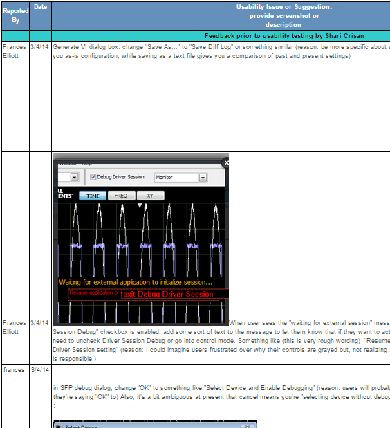
I used our Jive-powered social business platform to keep track of my usability feedback:
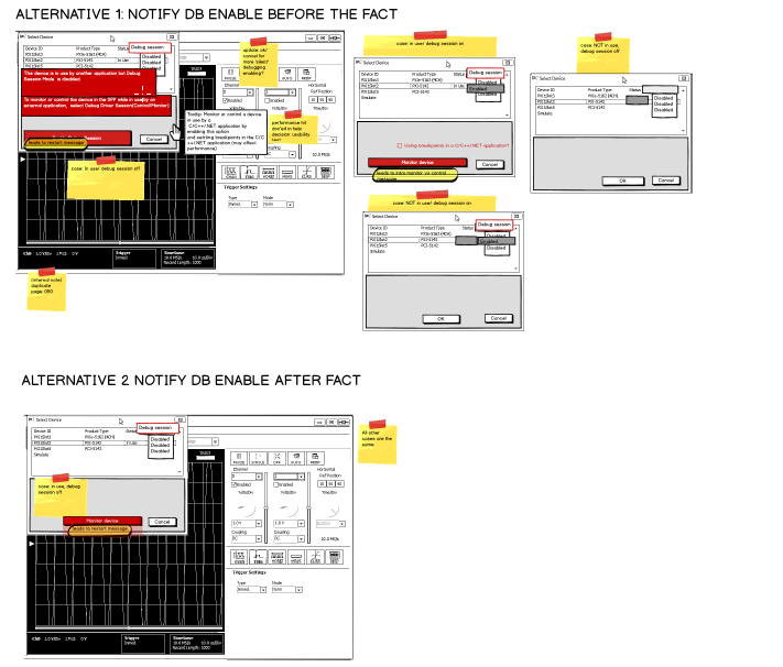
And I used Balsamiq wireframes to drive team meetings around terminology and workflow alternatives:
I learned that despite having a strong visual bent, I’m really, really wedded to words and concepts rather than visual design or actions. In fact, I infected the developer team with my perspective–when our usability expert led us in brainstorming solutions to the top 5 user challenges we’d witnessed in testing, she remarked, “I’ve never seen engineers so concerned with wording.”
But sometimes my insistence on naming things was a boon. For example, I suggested renaming a button from “OK” to “Select Device and Enable Debugging.” Even at the time, I realized that’s a bad label for a button (way too long!), but my suggestion did highlight how very overloaded that button was in the first place, which led to a redesign of its function.